Pokemapping: a simple process to replace personas
Summary for quick readers: personas have problems, but the idea of empathizing with people is nice. With Pokemapping we’ve invented a simple way to replace personas.
The goal of Pokemapping is simple: translate findings from research into action and give your teammates a sense of who these people are that use your products. In this article, I’ll give you a simple three-step process for using research findings in design.
Excited? I am! It’s every designer’s wet dream: writing an article about how bad personas are and propose a solution!
Why Pokemapping? #
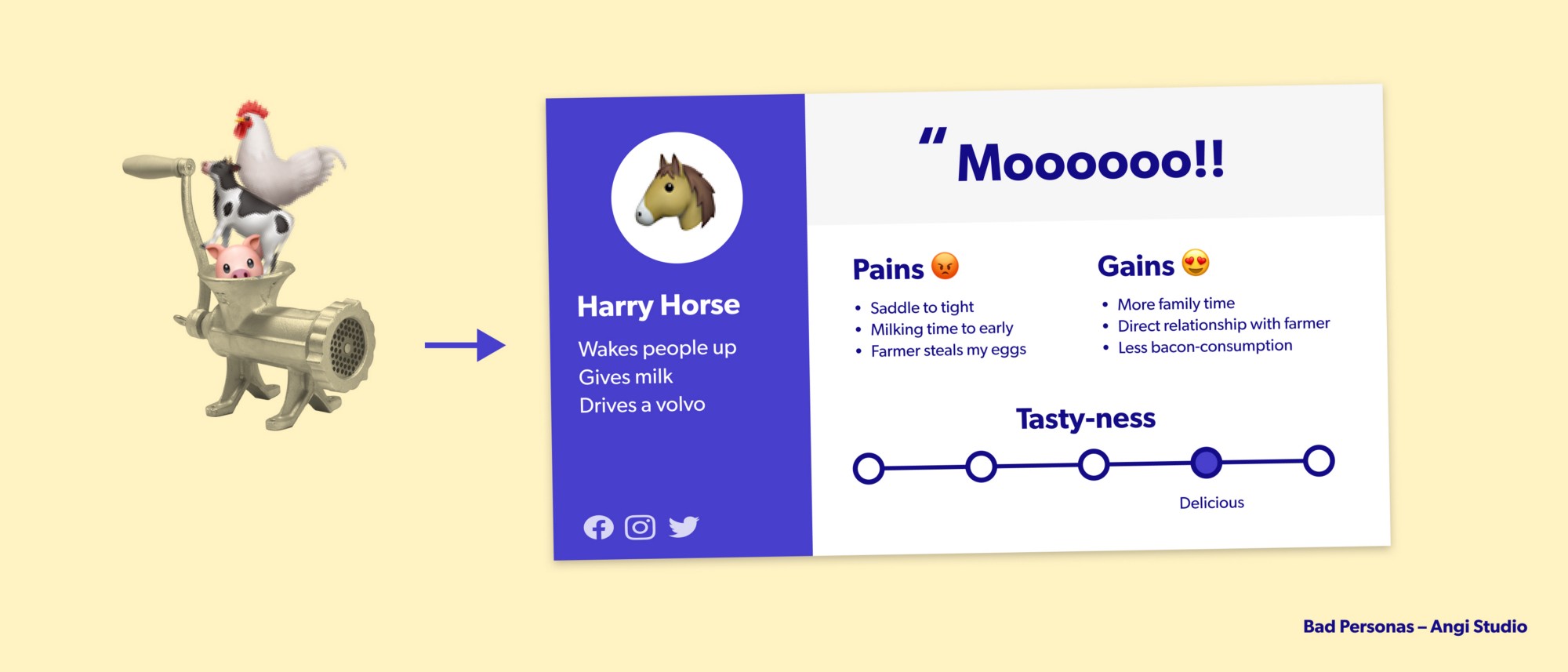
Personas were invented for translating insights from research into the product development cycle, but they are used wrong.
Books have been written about how bad personas are. Many books. We can fill two internets with people ripping into personas.
I’m going to keep it short: personas are fundamentally bad and they are used wrong in practice:
- Fundamentally, personas are bad on a philosophical/psychological level. The idea of persona is compacting many different people into one fictional character. This character does not exist. It’s an abstraction. We threw away anything that made this person unique and that’s problematic because our minds will automatically fill in those details based on assumptions we have. (Not convinced? Look at the last question in my FAQ below!)
- Personas are used wrong: people fill in a template and they imagine 80% of the content. Such personas cannot be used by designers, product owners, or developers. And thus, the zombie-persona is born: lots of work to make, big introduction-party in the company, and they are then forgotten about (and are left for dead, pinned on a designers-wall)

We say that personas create empathy. But how can you have empathy with people that don’t exist?
Personas are bad. But there are many other ways to translate research for product- or service design! You can think of Jobs-to-be-done, persona-spectrums, journey-mapping, switching forces, customer profiles, ODI…
And now we introduce yet another method: Pokemapping!
How to get started with Pokemapping, today! 🎉 #
Use Pokemapping as a way to translate interviews on a specific topic into useful insights of your target audience.
Pokemapping requires preparation. Steps one and two are done by researchers, step three can be done with your whole team.
✅ Step 1: interviews #
Pokemapping starts with interviews. You can enhance that qualitative data with other data later, like surveys or analytics (mixed methods, yeah!), for extra impact.
Like always, make sure you focus on a good segment of your audience and on one specific topic. Interviewing random strangers about everything is a waste of time.
✅ Step 2: summarize your interviews into user cards #
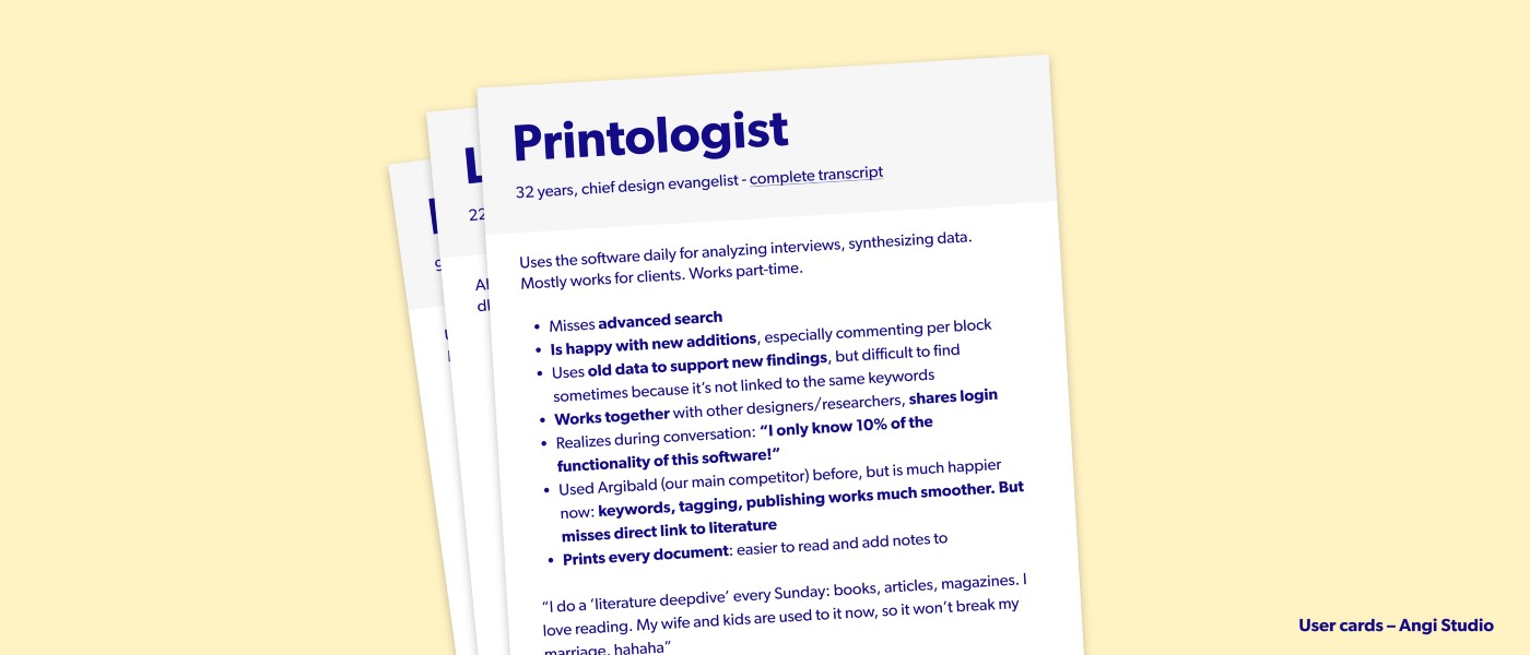
For each interview, you create a summarized version of your notes. You can use literal quotes or rephrase/summarize. You can move data from the interview around if it makes a better story (if someone mentions printing a document at the start of the interview and again in the end, you can group these findings). Add a link in each card to the complete interview transcript or video.
We call this a user card: a summary of an interview with a real person.
Give the user card a name. Not a human name, just something you can refer to. I focus on features that made the interview unique (‘printsalotix’ for a person that prints a lot of documents). Sources of inspiration for names are Pokemon names (‘printard’), Asterix and Obelix (‘printsalotix’) or ‘sword names from Game of Thrones’ (‘paperslinger’). If you are boring, you can use numbers for the names (P1, P2, …).
Make your cards on a virtual whiteboard like Miro or Mural, or print them out!

✅ Step three: grouping #
Now comes the ‘mapping’ part of Pokemapping! This is a fun exercise which you can do with the whole ~family~ team!
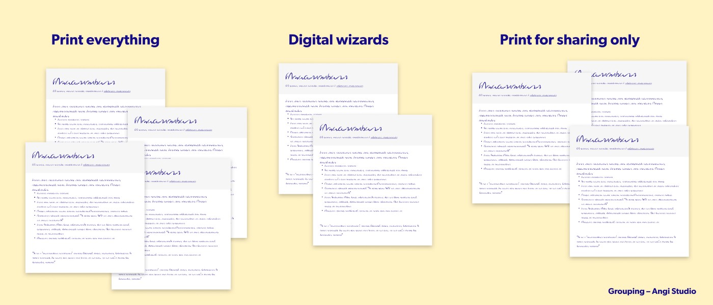
Let your team group the user cards into two or three groups. Resist the urge for easy groups (by function title, gender, or steps in the journey), instead, look at the data in the cards and create groups based on that. Name the groups with short descriptions (‘always fights with printing’, ‘prints because it’s easier to read’).
Now shuffle the user-cards-deck again and do another grouping. See which other patterns you can find in the data!
The goal of clustering user-cards is to discover features in your audiences, common threads.

Example time: a check-in experience at the airport #
Let’s make Pokemapping concrete with an example: Imagine working for an airline-company and you’re investigating the check-in&boarding journey. You interviewed 15 people and made user-cards out of them.
You start grouping the cards and writing down the groups. You then shuffle the user cards and group them again (and again).
This leaves you with several ways to ‘segment’ your audience based on properties, tasks, personalities:
- People with heavy bags
- People with a limited understanding of Dutch or English
- Travel goal (holiday, visiting family, business)
- Traveling alone, with a group, or with kids
There is overlap in these groups: you might notice that the same user-cards show up together in several groups. And it’s very easy to then imagine overlapping groups: the ‘holiday family with heavy bags arriving two hours in advance’ and ‘the business person in a rush with little luggage’. But then you’re making personas again! Don’t do that! Only focus on what you actually saw in the data. Why? Because it’s easy to imagine a counter-example: the musician traveling with an enormous cello for her concert in New York.
Using Pokemapping in design (and beyond! 🚀) #
Now you’ve got your groups, you can use them in design.
Take the user-journey we imagined in the example above: the check-in and boarding journey. It has several steps: arrive at the airport, check-in, give off bags, go through security, board plane. You’ll now go through the journey with each group you found: where are the pain-points in the journey for people traveling with kids? Where can we add extra value for people with heavy bags? Or take two or three groups: what if a person is on a business trip with his son and has limited English understanding, what happens in his version of the user-journey?
To make your case stronger, corroborate your features with other data like surveys and analytics. How many people fall into the group ‘heavy bags’? How often are people traveling for business or holidays?
To be fair, you might say: “ But Matthijs, I can do that with personas too?” And I would answer: “Not really!”
Let’s say we created two persona’s ‘Bob Business with a frequent flyer pass and knows the layout of the airport like the back of his thumb’ and ‘Jolly Jane who goes on a holiday with her kids, who’s confused and scared by the airport’. First of all: that’s stereotypical and misogynistic. Secondly, it’s too broad to use as a designer (how can I design for someone who’s confused AND has kids AND is scared). Thirdly, we can’t ask follow-up questions (“why is she scared?”) because there are no transcripts to go back to. Fourthly, we can’t corroborate with other data (how many people resemble the personas ‘Jane’ and ‘Bob’? Unknown. How many people are we excluding who are not falling into these two personas? Also unknown).
Another way you can use this method is to go back to the usercards. As Designer, you can take three random user cards and imagine how they’ll go through your newly designed flow. It’s a lightweight usability test.
Limitations of Pokemapping 😱 #
The limitations of Pokemapping are that it’s context-bound. Your interviews were related to one topic (remember, from step 1?), so your groups are not reusable for other topics! This is different from personas, which are meant as ‘evergreens’. Just because someone is always printing receipts after buying one of your products, does not mean they will want to print your support-documents!
Pokemapping is also not a replacement for traditional analysis: tagging your transcripts and doing in-depth analyses. You’ll gain different insights from that, especially when using a tool like Dovetail where you can combine findings from multiple interviews!
FAQs (FAntasized Questions) #
Here are some questions you might have about the process
Can I reuse my user cards for other situations? #
- Short answer: no
- Longer answer: I advise against it
Let’s look back at our ‘airport customer journey’. You find out there’s a group that arrives more than two hours before a flight, the ‘early birds’. You use that finding to see if there is enough seating area for early-arrivals, you can take away redundant check-in desks, etc.
But is ‘early bird’ a personality trait, or is it specific to flying? Can we reuse this for hotel bookings? I’m not convinced! Looking at myself, I’m always early for flights. But always late for meetings and family events. So we can not re-use the ‘early birds’ group in other situations!
Your interview has a context, your user cards are also in context.
This is a lot of work! #
That’s not a question, but okay. Fair enough, this is additional work. Plus you cannot reuse it. But it leads to new insights from the same data. It’s a net time-saver.
How does this relate to customer profiles? #
Customer profiles are a technique to segment and summarize your audience, they contain ‘pains, gains and jobs’ ( in the Strategyzer framework ).
The groups you create in Pokemapping can be starting points for profiles. Pick the groups that are most promising for the problem at hand (you need to choose, it’s your product/service), and you can build profiles with pains, gains and jobs. These you can now trace back to individual contexts.
Keep in mind, customer profiles are a business tool, not a research communication tool. A customer profile visualizes a mix of business decisions and research: you don’t put all jobs, pains and gains there, you make a choice which ones are relevant for your business. This makes it different from user cards (summary of interview of an actual person) and personas (a cobbled together nonexistent person).
Did you just reinvent Affinity Diagrams? (or Affinity Mapping) #
Eh, good question! Yes, this is related to affinity diagrams (a favorite UX-tool of mine), but it’s not the same. In an affinity diagram you group separate findings, instead of people.
You get different types of insights out of both exercises. With affinity diagrams you get findings related to your service, with Pokemapping you focus more on your audience behaviors. The added advantage is that with Pokemapping you might see more fundamental personality traits, things that are hidden throughout the entire interview (‘hesitant in answering questions’).
Can I make a persona out of a group of user cards? #
This is like asking “can I make lasagna from plastic”: you can, but why would you? You cannot consume the end-result.
I’m not convinced personas are bad, Matthijs? #
That’s okay. You don’t have to be convinced 🙈.
I can recommend going on a Wikipedia-journey: the jaggedness principle, no-true Scotsman, stereotypes, dehumanization, and (most importantly) the reification fallacy. After reading those, we can talk about the relationship of these concepts to personas over a beer 🍻
And if you’re still up for reading after that, try this article by Microsoft Design and this one by Emanuela and Lennart.
Thanks to Alienor for inventing Pokemapping with me!